
Moving home
Helping users quickly and easily inform their energy supplier about their home move.

Project overview
Moving home is a stressful time; for most movers, updating their energy supplier about their move ranks relatively low on their list of priorities. At Igloo Energy this process was manual with users having to communicate via phone or email to update their account.
This project was introduced to automate the process from the user end, so customer service agents were able to get the information they required and users could update us quickly and easily.
Goals
Convert the existing user journey to be fully online, allowing them to update their account simply and efficiently
Ensure customer service agents receive all information they require to process the home move, minimising additional user contact
Role
UX Designer | Idea Generation, UX Research, Wireframing, Prototyping, Brand Application
Tools
Figma, Lucidchart, Mural, Pen & Paper
Step 1: Research
For this project, much of the research lay in understanding the current manual process that customer service were using. I needed to understand what information they needed from users and how the journey could vary from user to user, so I could ensure my designs covered all the bases.

I began by speaking with members of our dedicated Home Moves team to develop this understanding and note what key information my journey would need to collect so they could properly process a home move in our systems.
I was also able to utilise our Customer Service Insight Forum, which I ran for 10 months, to collect wider feedback from different areas of Customer Service. This enabled me to understand a wider set of issues and provided me the opportunity to ask the opinions of the agents on what they thought would make both theirs and the users’ lives easier.
Through my research I identified some key problem areas:
Users often move out and forget to take meter readings, which we need to complete the account.
We did very little retention, either to encourage move in customers to stay with us or to persuade move out customers to sign back up at their new home.
There was often confusion over which periods users were responsible for paying for.
I was able to gather some examples of competitor moving processes, so I studied these and noted their strengths and weaknesses to learn how others had implemented this feature.
Step 2: Initial designs and feedback
The first action was to take on learnings from research and create user flows. I explored the different journeys a user may go down and crafted solutions for issues they may face, so I could deal with the problem areas identified in my research.

Sketches
Once the user flows had been developed, I took to drawing some early sketches. These allowed me to develop on the flows and assess where the optimal place to collect information could be. I sketched a few different concepts, and took forward the ideas that were most effective and user friendly.
Initial wireframes
Following on from sketching, I started designing wireframes. I began with low fidelity designs to bring through the journey I’d developed from user flows and sketching. Once this was in place, I expanded on the content of each screen so I could ensure the necessary information was being collected. As the majority of our users viewed our site on mobile, I started my wireframes at this size then added desktop and tablet wireframes when I was satisfied with the flow.


Feedback
Having put together the full flow in initial wireframes, I gathered early feedback through discussions with key stakeholders and by revisiting the Customer Service Insight Forum. Feedback was positive and I was able to identify some different features that the agents felt would be important to include.
We also decided to adjust the flow to allow move in users to set up their account and personal details first, then sort their payments and meter readings once in the account. This would allow users to obtain any information they may need to complete their move in, such as a copy of a recent bill, while still ensuring we were aware of the move in and had contact details for the user.
Step 3: Iteration and final designs
Design flow iteration
With the final flow decided following feedback, the next step was to update the design flow. Once I was satisfied that we had a flow that achieved all our objectives, I moved on to the final wireframes.
Final wireframes
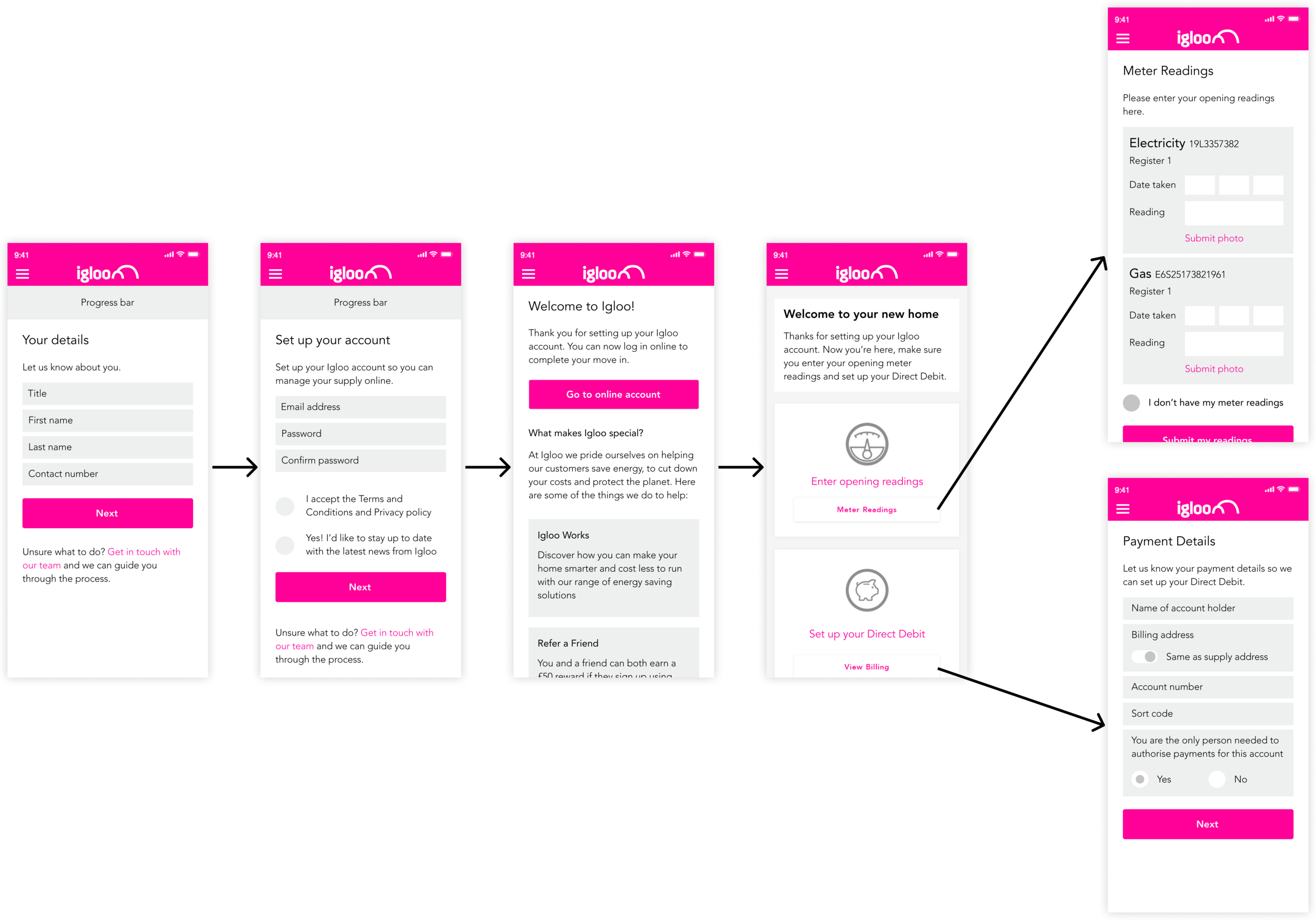
The final stage was to put together mobile, desktop and tablet wireframes using existing components ready to hand over to UI. I ensured that spacing and sizing was consistent with our brand guidelines so I could be certain that the flow was simple and effective.
Mobile


Desktop


Learnings
This project allowed me to expand my skillset around creating self-serve solutions. In particular, the challenge of addressing internal objectives while creating a user-centric design really helped me improve on balancing stakeholder expectations alongside providing my users with the best experience. The use of the insight forum and internal research gave me the opportunity to dive deep and identify the root problems of the current process, so I could address them when I took the journey online.
In future it would be good to take the user research further by reaching out to recently moved users and collecting their thoughts on the existing experience. This would supplement the internal research with a different perception on any issues that may have been present.